
Roadmap for a MN license consultancy to relieve stress for caretakers.
Research-Informed Brand Assets and User-Centered Forms
"Care Consultants," a consultancy aimed at assisting care providers needing a 245D license in Minnesota, required a comprehensive design strategy to address the needs of potential and current care providers.
This involved creating user-centered forms and impactful brand assets for effective communication.
There are many materials needed to reference when filling out the form.
The checklist helps the users feel prepared.
Simplifying long and arduous government forms.
This eases the process for care providers so they can focus on what really matters.
My part of the team
Roles
Group Collaborator
Brand Asset Designer
Presenter
UX Researcher
UX Designer
Tools
Figma
Figjam
Google
Youtube
Quicktime
Adobe Illustrator
Zoom
Chat GPT
Notion
Methods
Deep Dive Research
Competitive Research
Prototyping
Stakeholder Interview
Design Strategy
Empathy and Research:
Conducted a deep dive into the competition that currently exists and explored similar fields to gather insights.
Analyzed free resources, scheduling, contact forms, and in-depth help offered by competitors.
Found inspiration in TurboTax's application of UX heuristics to simplify complex government forms.
Our client is not alone in the market and needs to stand out.
Improving the readability of the form itself was a unique feature not offered by competitors.
Guiding strategy statement
All user experience touch-points for the Client will help Applicants and Providers to feel at ease and confident so that they are able to successfully obtain and maintain their 245D license so that they can provide quality care for their community without out the fear of corrective actions, audits, or losing their license.
We will do this by focusing on using a warm and welcoming approach that serves both tech-savvy and not tech-savvy applicants and providers.
As a result we hope to see an improvement in the visibility of important steps to obtain and maintain a 245D license through an increase of approved applications and renewed licenses.
The touchpoint strategy map connects all the players.
We needed to map out the touchpoints for the Consultant, their clients who provide the care, and the MN DHS who provides licensing.
We strived for inclusivity, recognizing that individuals vary in their level of technological expertise.
My focus was on social media and brand identity.

A education Youtube channel is beneficial to clients as well as a revenue stream with ads.

TikTok is a great way to reach the future of caregivers.
Clickable and relevant links, Page indicator, Saved annual information makes renewal seamless.

Underlined text affords the ability to click so users can see only the information they need and in a simple and digestible way.
Surrounding the page indicator with a shape lets the user know what page they are currently on.
By saving the input information from previous years, users only need to change the details that actually have changed.
All other information is automatically input.
Status Bar, Checklist, Icons, Page-navigator arrow buttons, Confirmations, Auto-Save ease the burden of a long arduous forms.

Keeping applicants engaged by seeing their progress bar update as they move through the application.
Words of encouragement update and change to match the status of the application.
By having a checklist before the application starts, applicants can make sure they have all of their materials with them to ensure success when applying.
Icons afford the user the ability to visually confirm that they are looking for the right forms and files.
These buttons afford the ability to go back one page if you have made a mistake or need to see a previous page.
The "next" button is clickable when the info on the page is complete.
When a user has completed all tasks, a message will appear letting them know that everything is complete and they can move on.
When the "auto-save" notification is green, it is indicating that all changes have been saved in case of a loss of connection or if the user has to stop for any reason.
Radio Button for single selections, Chunked paragraphs for long questions.

When only 1 option is an acceptable answer, a radio button is used to eliminate accidental misunderstandings, double clicks, and other errors relating to the selection.
Currently the same information in this question is all one block of text which can be overwhelming to some users.
By breaking the sections out into separate paragraphs, the users comprehension of the material will increase.
Brand Assets
Colors for building trust and calm

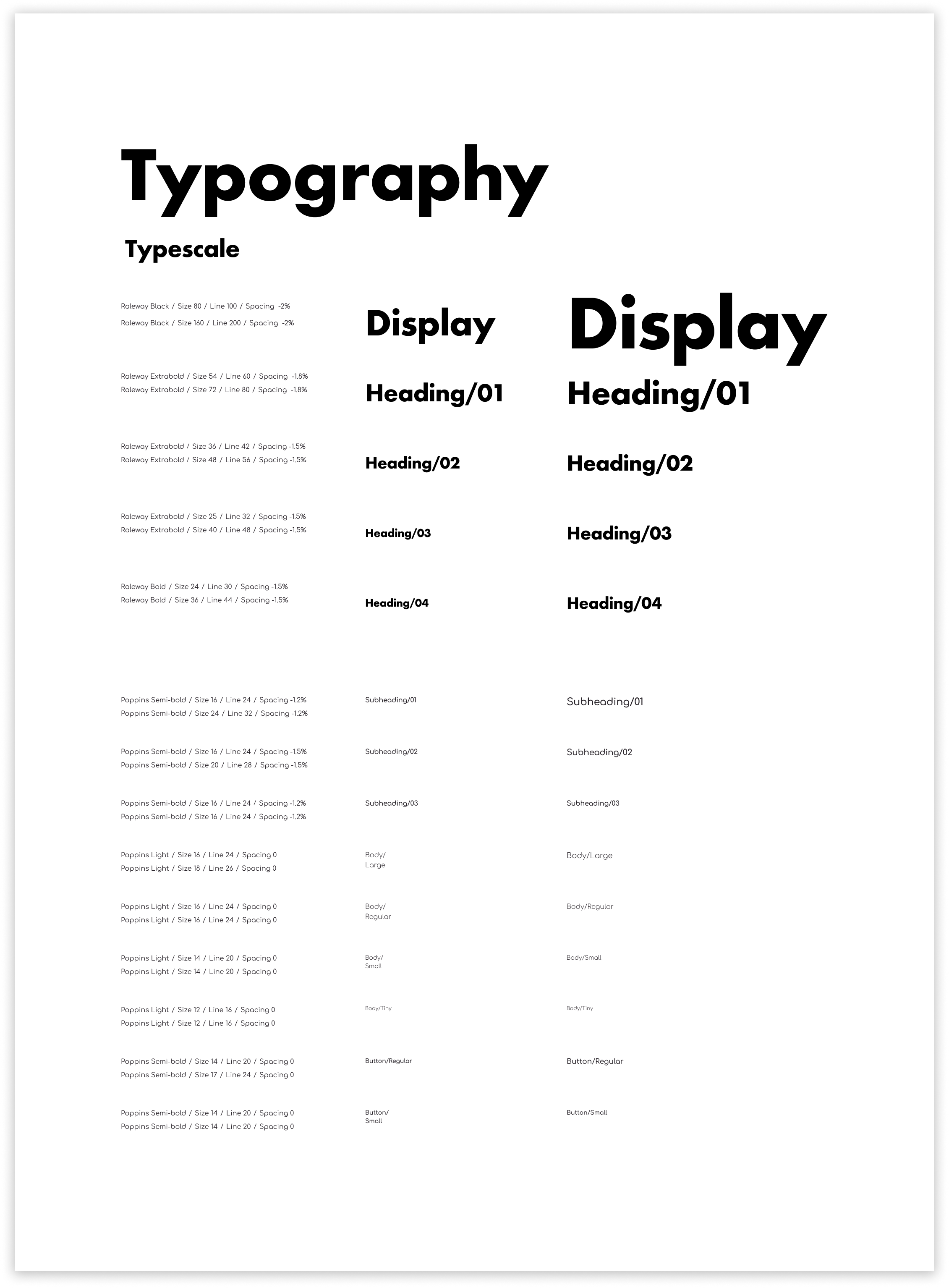
Friendly and readable fonts
Logo reflects healthcare and inclusivity.
Designed to build trust and a sense of welcoming.

Results and Impact
The design strategy focused on a warm and welcoming approach to assist both tech-savvy and non-tech-savvy care providers in obtaining or maintaining their 245D license.
The touchpoint prototypes emphasized accessibility, education, and ease of use. Brand assets were designed to establish a strong online presence and maintain consistency across touchpoints.
Conclusion
The design strategy prioritized user-friendly touchpoints and effective communication to guide care providers through the 245D license process.
The collaboration among team members and alignment with the guiding strategy ensured a cohesive approach.
The prototypes presented innovative ways to educate and engage users, promoting a seamless experience towards licensing.
The design strategy emphasized user-centricity and aims for an increase in approved applications and renewed licenses.
Future Recommendations:
Continued usability testing and refinement of touchpoints based on user feedback will be crucial for optimizing the user experience.
Further exploration of digital tools and platforms to reach a wider audience is recommended.
Ongoing evaluation and updates to the touchpoint strategy based on the evolving needs of care providers will ensure the continued success and impact of the consultancy.